Charts and Business Reports with UISPIN
UISPIN makes it easy to develop new components that can be used like HTML tags in a document. Those components may comprise of a complex snippet of HTML and other XML-based languages such as SVG. UISPIN components can be published on the web, where they are identified by their URI. UISPIN Charts is a library of reusable components for visualizing data on charts and maps. Based on Google Charts and Google Maps, there is no need to install anything - the components are entirely declarative and ready to use.
The UISPIN Charts page shows many example screenshots of the various kinds of charts and maps that are currently supported: Pie charts, Bar charts, Map charts, and Google Maps. More will be added in the future.
Here is a step-by-step tutorial illustrating how to use those charts. We will create the pie chart shown in the following screen shot.
Let's first look into the RDF model of the data that we want to visualize. This data is about election results, and is downloadable as a Turtle file from here. Download it into your TopBraid Composer ME 3.3 workspace to follow the exercise.
The data file defines the classes shown in the diagram below. Instances of the class ex:Election point to a collection of ex:ElectionResults. Each result links a party with a percentage (an xsd:float literal).
Here is a form view of the ex:Election instance that we want to visualize. There are four ex:ElectionResults and they are blank nodes.
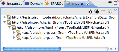
In order to use the chart components, we need to create a file that imports the UISPIN charts vocabulary. We can either import this namespace into the data document itself, or we can create a new document that imports both the charts and the data model. Since we do not want to clutter the data file, we create a new RDF file and drag the charts namespace as well as the data model into the Imports View. The charts namespace is part of the system ontologies, under the TopBraid/UISPIN project. The imports view should look similar to the following screenshot.

Having both the domain model and the charts namespace in the same RDF model allows us to create links between the Election classes and suitable visualizations. Select the class ex:Election so that it shows up on the form. You will now see a property ui:instanceView on the form. This is where we will put the definition of the pie chart later.
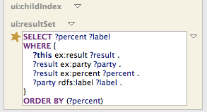
But first let's think about the actual data. Pie charts visualize slices of data in proportion to one another. Each slice can have a label (here: the name of the political party). These value-label pairs form a table, and this table is the input to the pie chart. Select the instance of ex:Election (ex:AustralianFederalElection2006) and use the SPARQL View to run the following query:
This query returns the numeric value in the first column, and the label in the second. This happens to be exactly the format that the charts:PieChart component expects. Note that the query above uses a built-in feature of TopBraid Composer: in the SPARQL view, the variable ?this is pre-bound with the currently selected resource.
Go back to the class ex:Election and locate the ui:instanceView property on its form. We could now add an empty row and type the UISPIN snippet of the pie chart in, but in this exercise we use a different route: Open the context menu behind the ui:instanceView property name and select Create blank node... which opens a class selection dialog as the following.
You need to select the class charts:PieChart here. In order to find it quickly, click on the Group by namespace button in the lower left corner. After clicking on OK, a new anonymous instance of charts:PieChart will be created and displayed as a nested form as shown next.
This nested form will enumerate all potential arguments of the pie chart class, including charts:label and ui:resultSet. Scroll down to find the widget for ui:resultSet, add an empty row and copy and paste the SPARQL query from the query view into it:
 Now, go to charts:label and select Add SPARQL expression from its context menu. This will open up an empty row, in which you can paste the expression ui:label(?this), which will insert the name of the current election into the pie chart. Finally, set html:width and html:height to 500 by 240 as shown below:
That's the complete definition of our pie chart, and closing the nested form you can see its XML syntax:
You could have entered this directly in XML syntax instead of going through the form. In any case, we can now go back to the instance of ex:Election and click on the Browser tab at the bottom of the editor window to get the screenshot from the top of this article.
This pie chart is now the default visualization of all instances of ex:Election. But since the charts:PieChart element is just one among many other available elements (including the whole range of HTML tags), we can turn the pie chart into a comprehensive report that contains other views (such as a charts:BarChart), an HTML table and whatever else we want to display.


<< Home